
I’ve walked into corporate flight departments where the hangar floor was so clean you felt you could sit down and eat a meal off it. You could have taken the cowling off one of the jet engines and eaten off that, too. Nobody had to tell you how that flight department ran. You could see it. The pride they took in that airplane was the same pride they took in their passengers, and it showed in every corner of the place.
I’ve also walked into flight departments where I didn’t want to sit down in the chairs. The magazines in the lobby were two years old. Nobody had changed a thing in a long time. The pride had left that place long ago, and it made you wonder what else in that flight department was allowed to “just get by.”
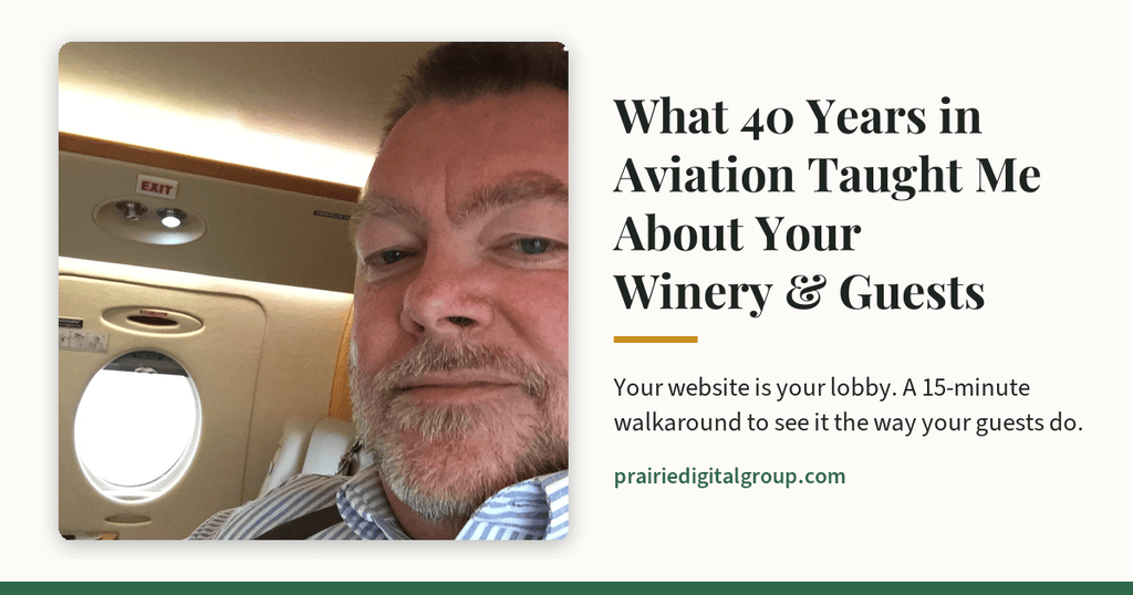
I spent more than 40 years in corporate aviation, and those two kinds of places taught me something I still believe: people can see how much you care before you ever say a word.
Your guests can, too. And today, the first place they look isn’t your tasting room. It’s your website.
Key Takeaways
- Your website is your lobby. Guests judge your winery’s pride and care by it before they ever arrive.
- The easiest problems to spot are the ones owners stop seeing: outdated events, hard-to-find wine club details, PDF menus, clumsy checkouts.
- Great service anticipates what the guest needs instead of making them work for it. Your website should do the same.
- A website that works for every guest isn’t a technical detail. It’s hospitality.
- You can perform the walkaround below yourself in about 15 minutes.
Aviation and wineries run on the same thing
Corporate aviation is nothing if it isn’t about relationships, quality service, and a first-rate product. The airplane matters, of course. But what keeps a customer for decades is how they’re treated, every single time.
A winery is the same. You make a product you’re proud of, and you pour it for people in a place you’ve worked hard to make welcoming. Your guests come back because of how the whole experience made them feel: the wine, the view, the people, the care.
That relationship now starts before anyone pulls into your parking lot. A couple deciding where to spend Saturday afternoon will pull up your website on a phone, maybe sitting in the car, maybe on the couch the night before. In aviation terms, your website is the lobby. It’s the first impression, and it sets the tone for everything after.
So here’s how I’d look at your website, using the lessons those hangars taught me.
Lesson 1: Pride shows in the details
That spotless hangar didn’t happen by accident, and neither did the two-year-old magazines. Both were the result of small choices, made day after day.
Websites work the same way. Nobody decides to let their site go stale. It happens a little at a time: an event that’s over but still listed, a “new release” from three vintages ago, a photo of staff who moved on.
Your walkaround check: the magazine test. Open your website and go looking for the oldest thing on it. Check your events page, your news or blog, your current releases, and the copyright year at the bottom of the page. If you find something out of date, your guests have probably found it, too.
When I look at a winery’s website, my first question is: Is this something the winery takes pride in, or is it an afterthought? Was it built years ago and forgotten, or is it a living part of how the winery welcomes people? You can usually tell within a minute or two of browsing.
Lesson 2: Great service anticipates. It doesn’t make the guest work.
I’ve been in FBOs (the private terminals where corporate aircraft and their passengers arrive) that seemed mostly interested in charging for extras the customer didn’t need. And I’ve been in FBOs where the staff was moving before the customer even knew they needed something. You never forget the second kind.
On a website, anticipating your guest means the things they came for are easy to find and easy to do. No hunting. No dead ends.
Your walkaround checks:
- Is it inviting? Look at your homepage on your phone, as a first-time visitor would. Does it make you want to visit?
- Is it easy to get around? Can you find your hours, location, and what’s happening this weekend within a tap or two?
- How’s the front door? If your site opens with an age confirmation screen, try it on your phone. It should take one tap and get out of the way, not stand between your guest and your welcome.
- The wine club. Starting from your homepage, count how many taps it takes to learn what your club offers and to actually join. If you lose count, so will your guests.
- Buying a bottle. If you sell wine online, buy one yourself. Notice every moment where you hesitated or had to stop and figure something out.
- The menus. If you serve food, is the menu a real page, or a PDF? PDFs are often hard to read on a phone, and they can be difficult or impossible for guests who use screen readers. A simple, good-looking menu page is friendlier for everyone.
Lesson 3: Be there when the guest needs you
When I started out in customer support, I was on call 24 hours a day, every day of the year, except when I was on vacation. That’s how I was trained, and that’s how corporate aviation works. Customers fly around the world at all hours, and when they need help, you are their support.
Your winery has closing hours. Your website doesn’t. At 10 o’clock on a Tuesday night, it’s the only member of your team who’s working. It’s answering questions about your hours, your wines, your events, and your wine club for anyone who asks.
Your walkaround check: Send yourself a message through your own website’s contact form, and make sure it arrives where someone will actually see it. Then ask yourself whether the questions guests ask your staff most often are answered on the website, so it can help them when nobody else is there.
Lesson 4: The airplane has to work for every passenger
In aviation, you don’t get to choose which passengers board. Everyone who comes aboard deserves the same care.
This one is personal for me. I’ve used crutches full-time since I was 22, about 48 years now. I spent 40 years crawling around aircraft, selling, and supporting customers across the country on crutches, and everyone I worked with in aviation knew me that way. My motto has always been “It’s only an obstacle.” But 48 years on crutches also means I notice obstacles. Steps without a railing. Doors that are heavy. And websites that only work if you can see a small gray font, use a mouse, or read a PDF.
Some of your guests use screen readers. Some navigate with a keyboard instead of a mouse. Many simply have older eyes and turn up the text size on their phones. A website that works for all of them isn’t a technical nicety. It’s the same hospitality you’d show anyone who walks through your door, and every obstacle you remove is one less reason for a guest to give up and go somewhere else.
Your walkaround check: On a computer, put your mouse aside and try to get around your homepage using only the Tab key. Can you see where you are on the page? Can you reach the menu and the wine club? Then, on your phone, turn up the text size in your settings and look at your site again. Is it still readable and usable?
Why I focus on the digital side
My wife and I enjoy wine, and we love visiting wineries: sitting outside with a glass, taking in the view, sometimes learning the story behind the place. I grew up on a farm, and most wineries we find are in that same kind of rural setting we both love. When I decided what my next chapter would be, building it around wineries was an easy choice.
What I bring is the part of the guest relationship that happens on a screen. Your website, your Google listing, and how your guests find you and connect with you before they ever arrive.
I spent a big part of my aviation career in sales, and I always told my customers the same thing: I never considered myself a salesperson. I was a partner and a problem solver. I wasn’t there to sell them something. I was there to help them solve a problem, and when they needed something, I wanted them to think of me with trust and respect. That’s still how I work.
Your 15-minute walkaround
- The magazine test: find the oldest thing on your site.
- First impression: open your homepage on your phone. Is it inviting?
- Easy to get around: find your hours, location, and this weekend’s events in a tap or two.
- The front door: if you have an age screen, make sure it’s one quick tap on a phone.
- The wine club: count the taps from the homepage to joining.
- Buying a bottle: try your own checkout.
- The menus: real page, or PDF?
- After hours: send yourself a message through your contact form.
- Every guest: try your homepage with only the Tab key, and with large text on your phone.
Frequently Asked Questions
How often should a winery update its website?
There’s no magic number, but anything date-based (events, releases, seasonal hours, specials) should be updated as soon as it changes or ends. A quick monthly look through the site catches most of what slips.
Are PDF menus really a problem?
They’re one of the most common friction points on winery websites. They’re often hard to read on a phone, and they can be difficult or impossible for guests who use screen readers. A simple menu page solves both problems.
What if my website was built years ago? Does it need to be replaced?
Not necessarily. Many older sites just need attention: updated content, a smoother path to the wine club and wine shop, and fixes for accessibility problems. Replacement only makes sense when a site has truly outgrown repair.
I’m not technical. Can I really run this walkaround myself?
Yes. Every check above is something a guest would do. If you can use your website the way a guest does, you can spot what a guest would notice.
If you run the walkaround and find a few things you’d like a second set of eyes on, I’m always glad to take a look.
